Lots to Love But What's That Checkbox?
April 9, 2004 AM/Home
When you get past a certain age, or maybe its having kids, at some point anyway it seems like you just can't hold as much in your mind all at once as you once did. So you resort to different tactics to help you be a little more efficient with what you've got left.
One such tactic was to purchase a software "notebook". Notebooks are a class of software applications designed to hold, organize and enable searching through your notes. On any topic. (I wanted to use it to hold those niggling litte details that you need for each computer language, but really, it can hold any manner of stuff) After a little research, the best feature for the price application I was able to find was a program called Hog Bay Notebook, $19.95.
Its a relatively young application (version 3 in April 2004), and the author Jesse Grosjean is young, talented software writer. Normally all this youth would be a drawback, but instead its been a great source of interesting usability insights. I've already written a couple long comments in the user forum about two parts of Hog Bay's interface, its outline pane and bookmark side drawer features. Hog Bay Notebook is a rough jewel. I think its going to be fun watching it mature.
I say this as introduction. One of the more interesting lessons that Hog Bay's interface has pointed out to me is the importance of the icons and names to be task based, as opposed to interface based.
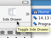
I've included two screenshots as examples. The first, and perhaps best example is the "side drawer" icon on Hog Bay's toolbar. I've included it below.

The whole bookmark feature seems a bit strange. If they're indeed called bookmarks.
The icon on the main toolbar is titled "Side Drawer", and not a more descriptive title, like say "Bookmarks". The icon itself is of a side drawer instead of a bookmark-y thing. On the positive side, I knew when I clicked it the side drawer was going to open! But its actual purpose was a bit of a mystery for a long time.
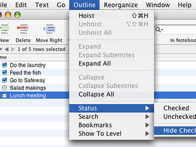
The second example is a "checkbox" feature. With this feature turned on, (its on by default) a checkbox is placed in front of every entry in the outline. I've included a screenshot of an example notebook below:

Note how the pulldown refers to the feature as "Hide Checkbox" under "status". What its for is to allow you to use the Notebook like a to-do list and check off tasks as you complete them. Unfortunately, nothing is labeled "to-do" anywhere in the interface. Instead we're left to wonder what's the checkbox for exactly? The title of this article, "Lots to Love But What's That Checkbox?" is taken from the title of a thread in the user forums asking that exact question.
Icons, names, these things are important. Using UI terms like checkbox and side drawer are really only fine for developers, and will lead to confusion for your real users. Setting your icons and names so that they explain what it is a user interface feature is intended for is the first step on the right path to a much more intuitive interface.